About the Project
SUITS is a NASA run collegiate competition in which teams research, design, and develop spacesuit information displays within augmented reality (AR) environments.
Challenge:
Assist astronauts with Extravehicular Activity (EVA) responsibilities during a lunar mission, specifically navigation, suit telemetry, geological sampling and note taking.
My Role:
As the sole UX Designer, I led my team through an iterative design process including:
- Challenge Analysis
- User Research
- Competitor Analysis
- Project Strategy
- Ideation
- Stakeholder Interviews
- User Flows
- Information Architecture
- Prototyping
*Note: Due to this project coinciding with the peak of the COVID-19 Pandemic, along with the need to be in person to test with AR headsets, user testing was unable to be performed and was replaced by virtual presentations and user feedback.

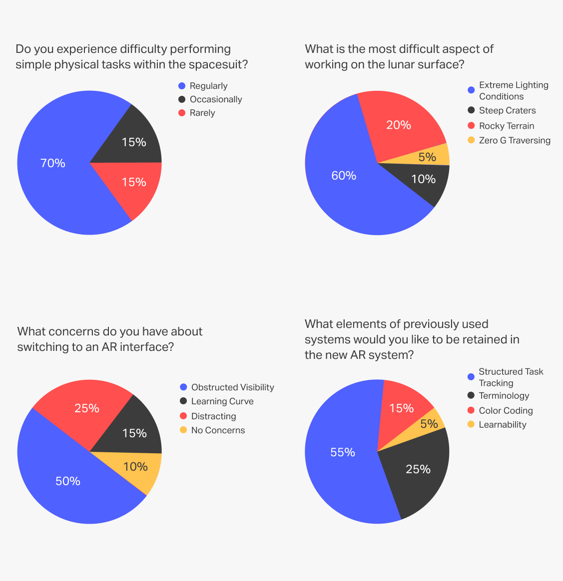
User Research
In order to gain an understanding of the unique challenges astronauts will face on a lunar mission, I conducted a survey. The participants of the survey are NASA personnel who have an understanding of EVA protocols, experience in astronaut training, and knowledge of the constraints of working in spacesuits on the lunar surface.
Key Results:
- 85% said that physical mobility within the spacesuit is a concern.
- 60% believe that extreme lighting conditions are the largest obstacle to working on the lunar surface.
- 50% are concerned that an AR interface would obstruct visibility.
- 55% would like the interface to retain a structured method of tracking tasks, as was used in previous missions.
Competitor Analysis
I was curious to see how other teams had approached similar challenges in years past. I was able to find a few walkthroughs of previous entries, and while the specific challenge changes every year, the demonstrations gave me valuable insight into how other teams approached introducing AR interfaces to a lunar mission.
Key Findings:
- Many teams used interaction models heavily reliant on pointing.
- Nearly every example contained a very busy interface with too much information showing at once.
- Very few teams took advantage of using color as a means of conveying information.

Problem Definition
Analyzing the challenge description and collecting insights from our users and competition allowed me to identify our user's needs, competitive opportunities, and potential pain points. Based on my research, I defined the four goals which our interface had to account for.
Design Goals:
- Allow for continuity of previously established mission protocols and methods.
- Avoid cluttered content while maintaining easy access to information
- Allow for interaction methods that require minimal physical movement.
- Remain easily visible in a wide range of lighting conditions.
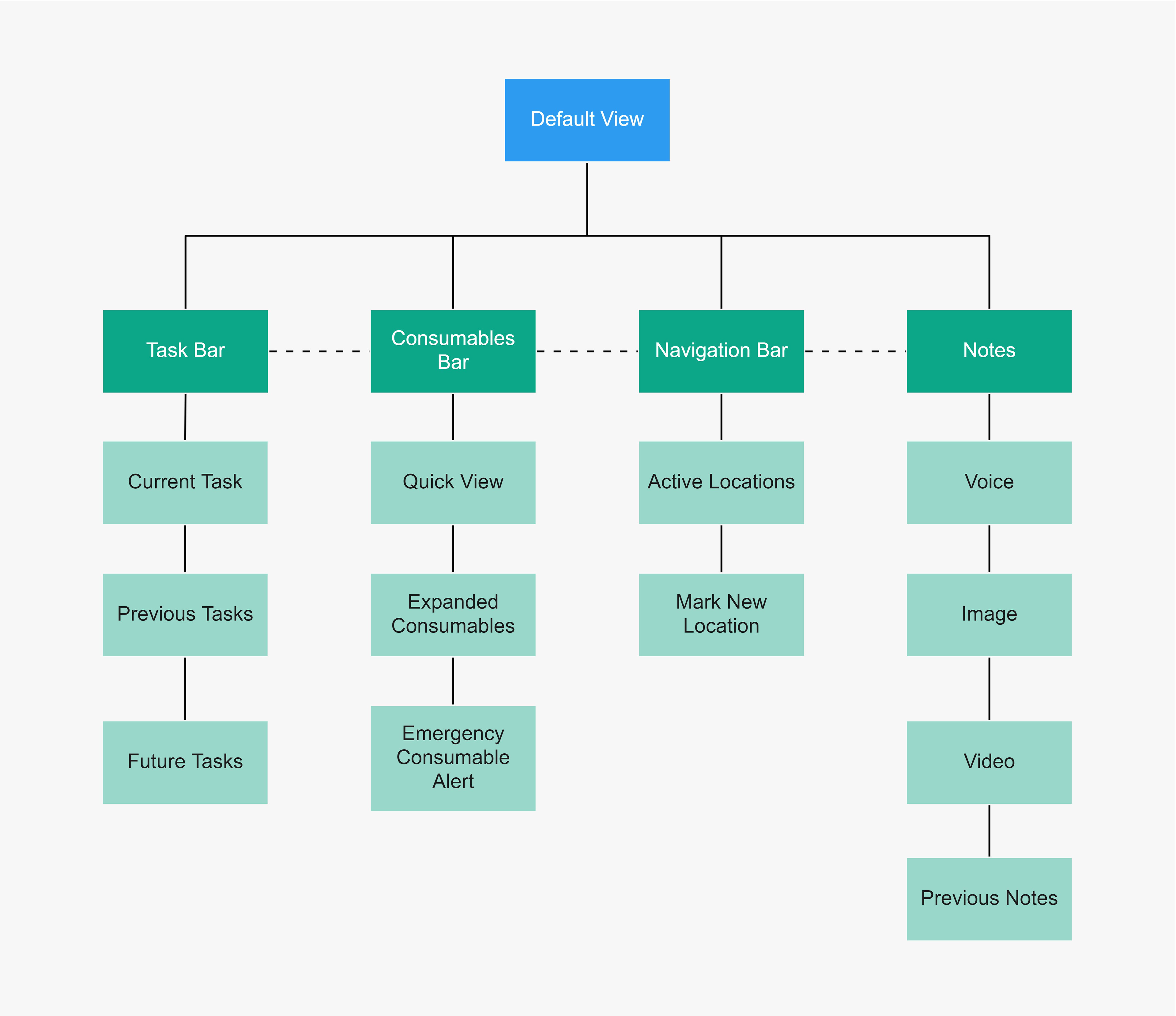
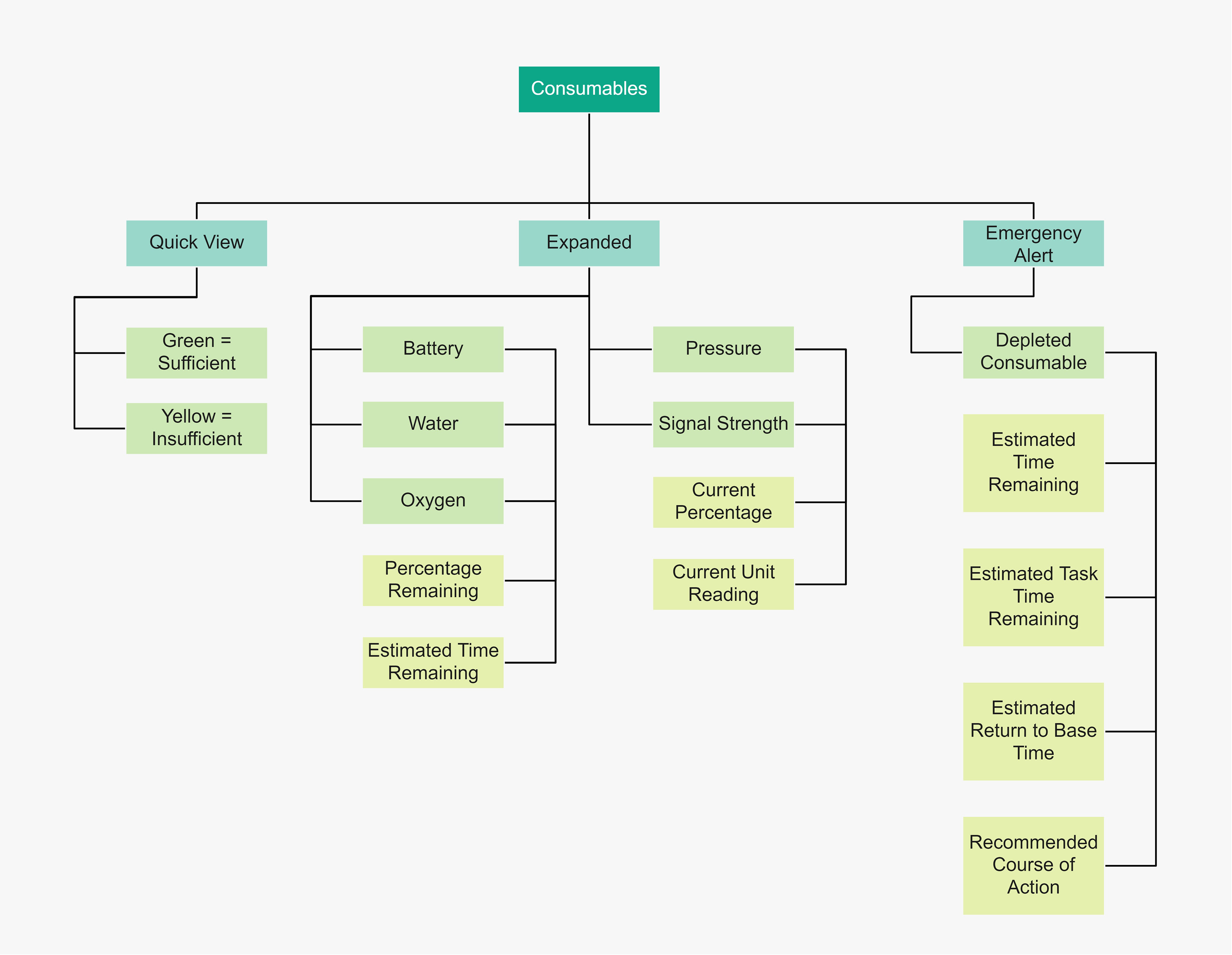
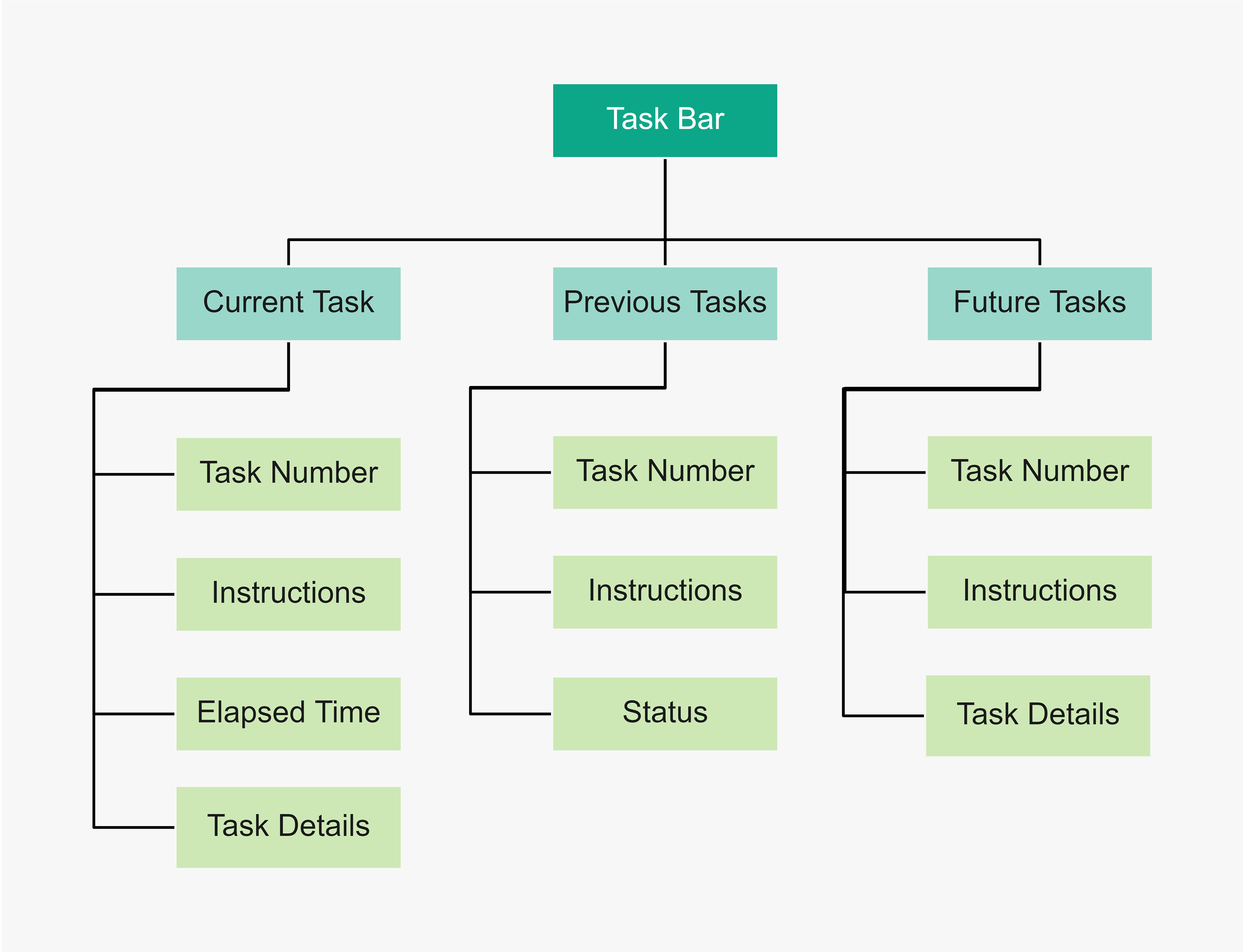
Information Architecture
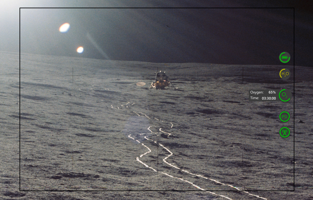
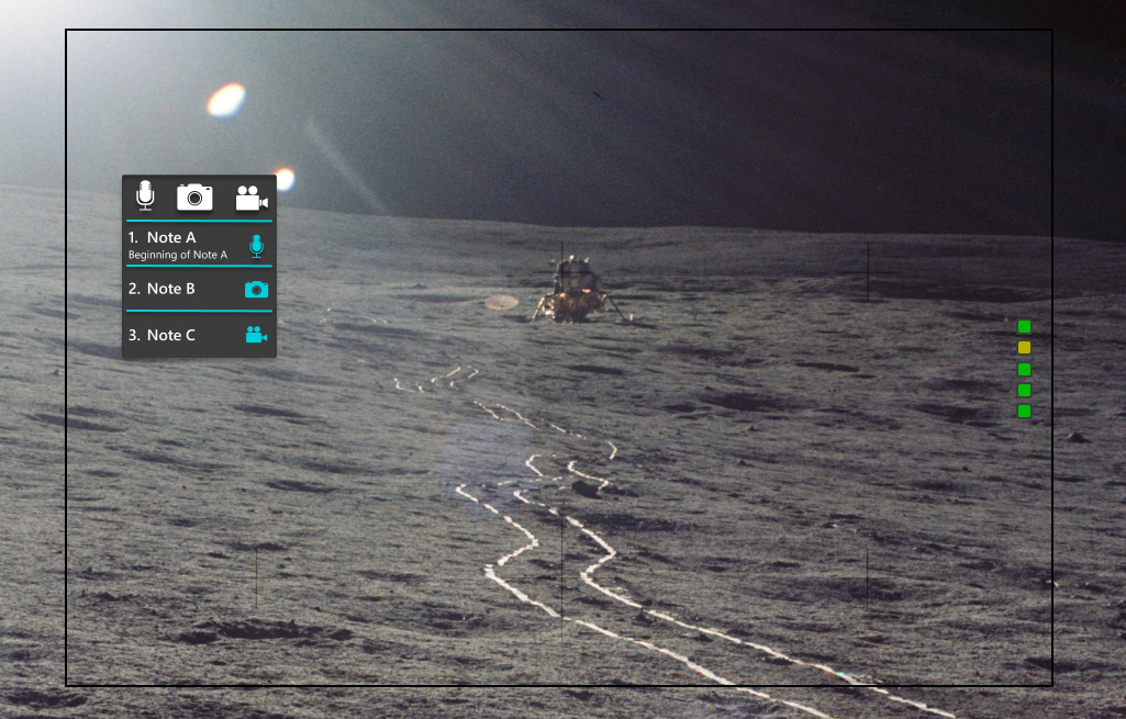
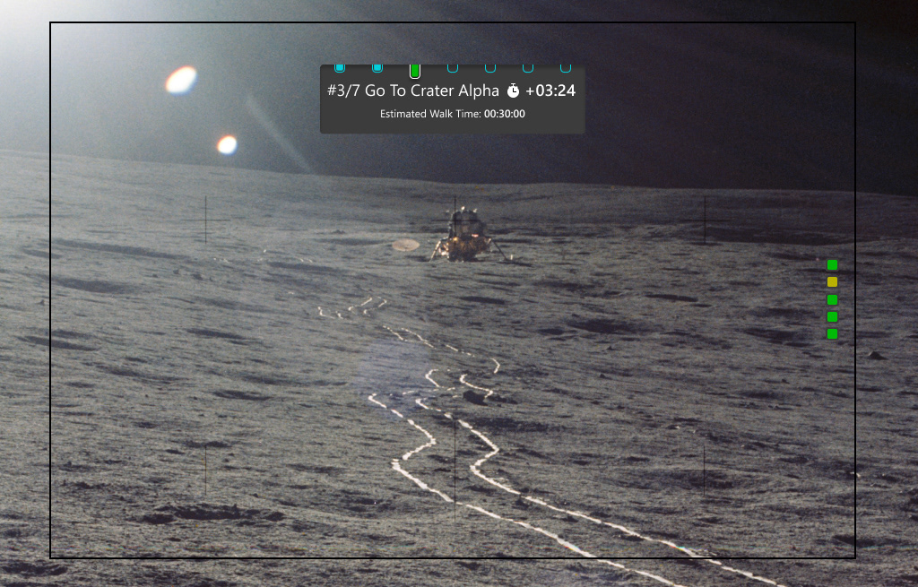
With our goals clearly defined, I began creating the structure of our AR system, made up of four main components: Suit Consumables, Navigation, Notes, and a Task Bar to maintain structured task progression
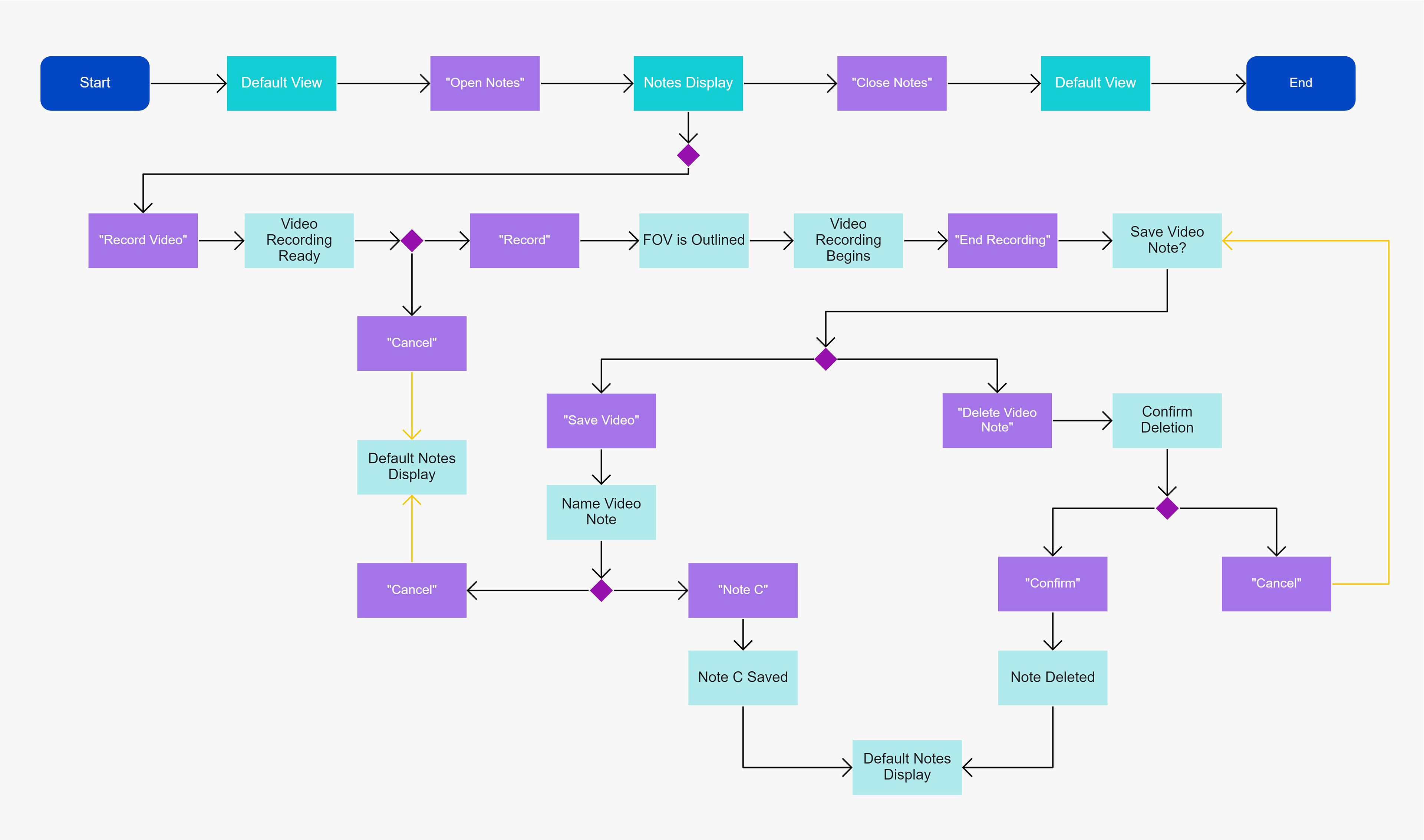
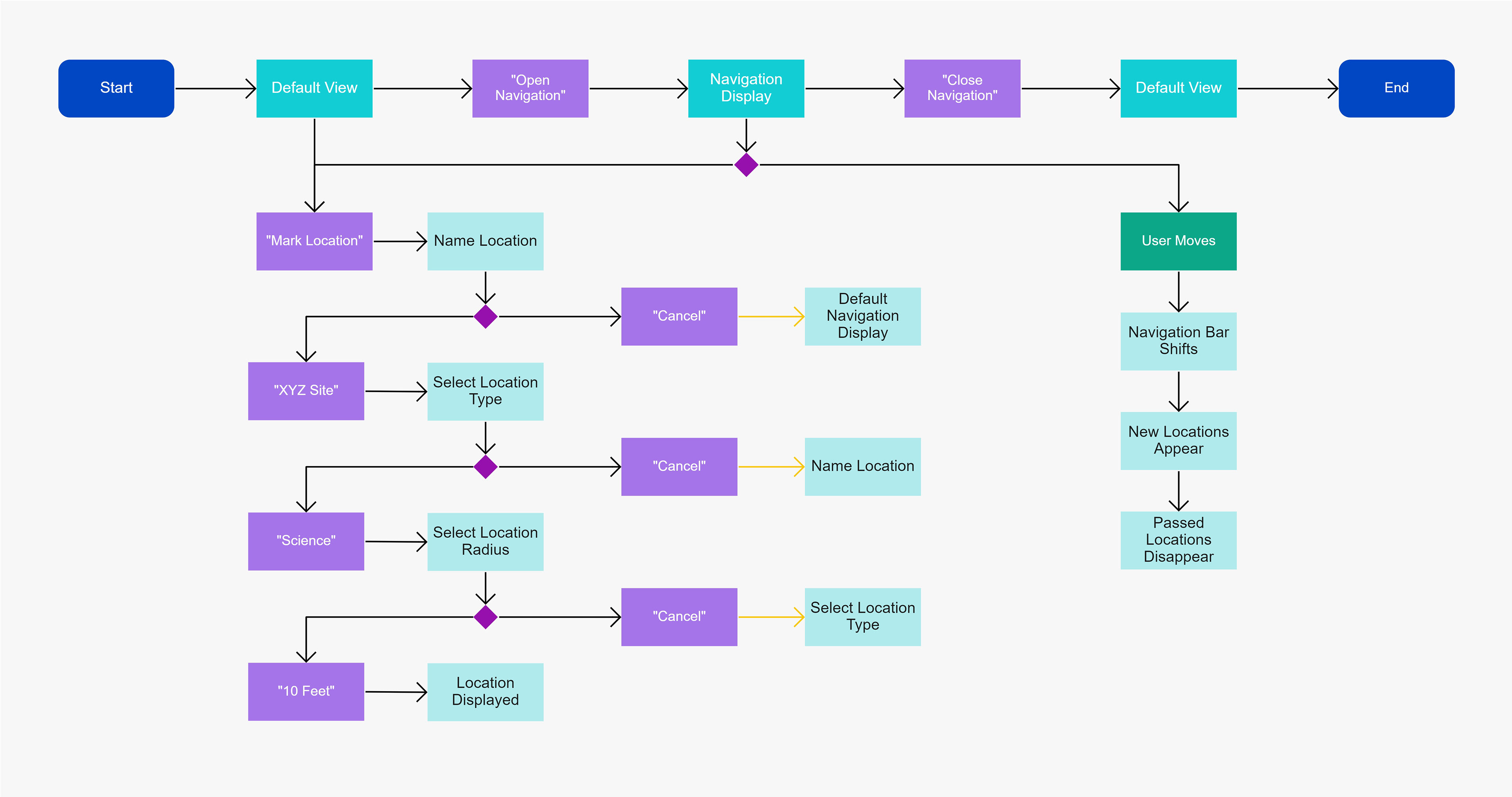
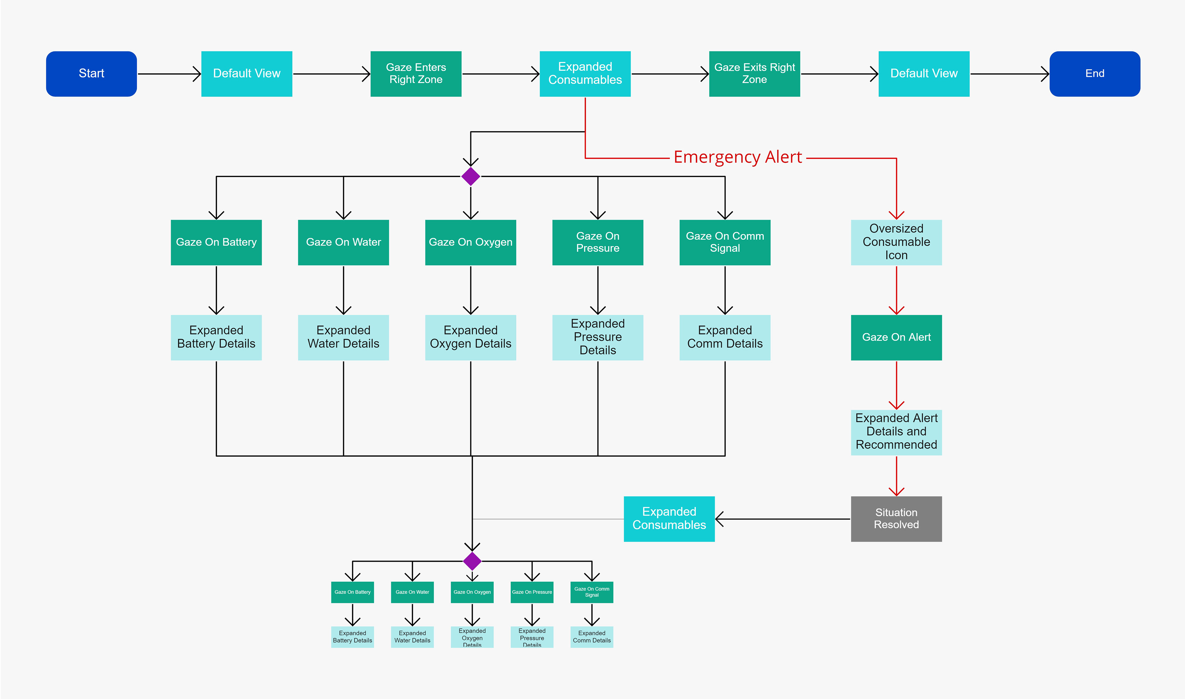
Navigation & User Flows
The next step was to map out how the user interacts with and navigates through the interface. I created flows for each of the four main components utilizing eye gaze and voice command interaction methods.

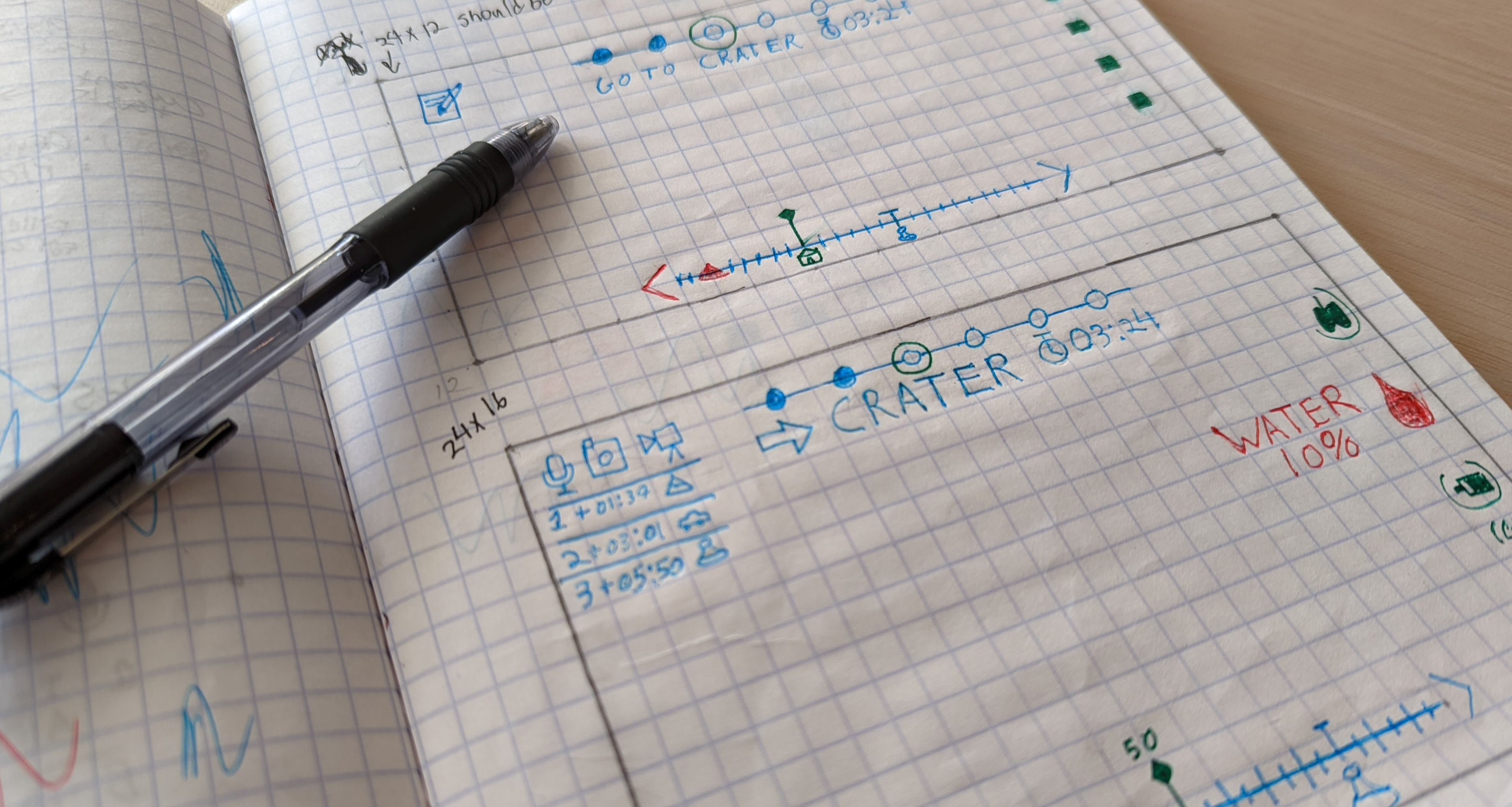
Low-Fidelity Prototypes
I made a few paper sketches to brainstorm the visual layout of the UI, and to gather feedback from stakeholders on the direction of the design.
Key Design Choices:
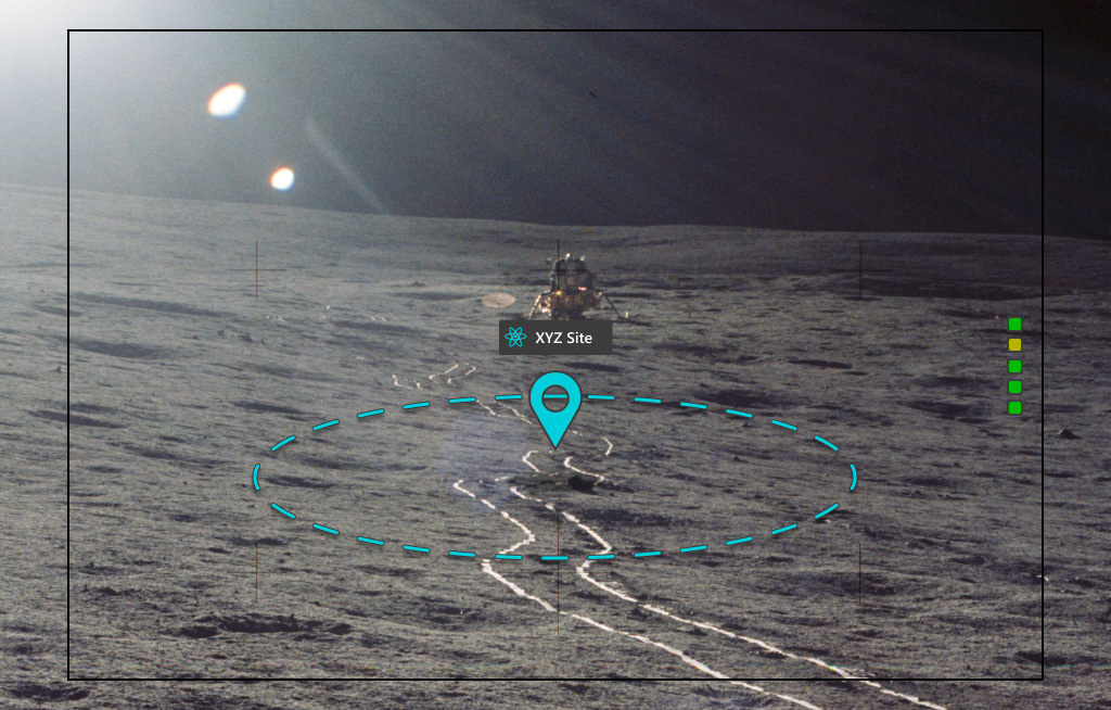
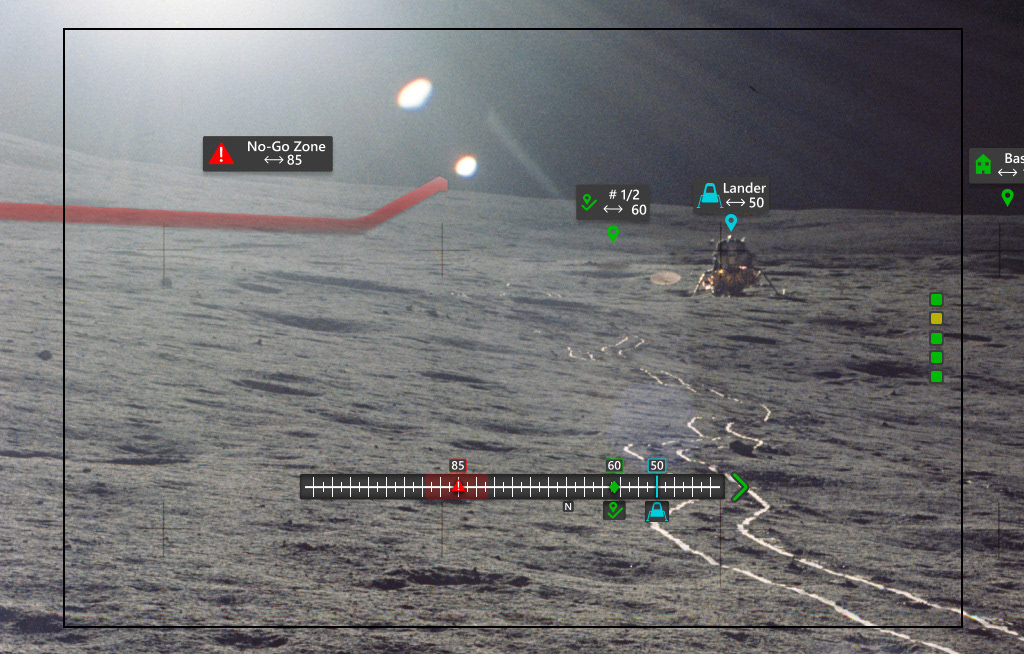
- Compass with three location types.
- Task bar displaying current task and elapsed time.
- Expandable consumable icons for quick access.
Feedback
Gathering feedback from users and stakeholders is a vital part of the design process. After sharing my concepts, I was provided with some very helpful input.
Notable Feedback:
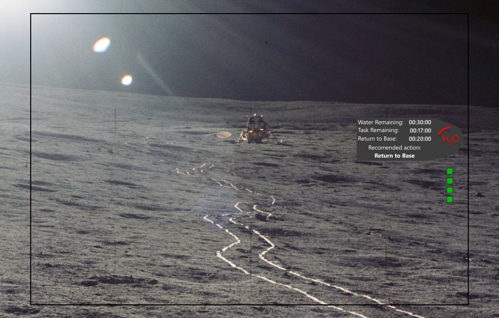
- Emergency warning needs to provide more information
- Include current task number on task bar
- Consumable icons may be difficult to identify quickly
High-Fidelity Prototype
Taking the feedback given to me, I revised the concepts in my sketches and moved them into an interactive digital prototype.
Key Design Choices:
- Swapped consumable icons for abbreviations.
- Emergency warning provides all necessary information and recommended course of action.
- All UI elements have a dark background to remain visible in difficult lighting.
Final Product Walkthrough

What I Learned from this Project
Designing an AR interface to assist NASA astronauts on lunar missions was an extremely valuable opportunity. The combination of unique user scenarios and the use of an emerging medium forced me to expand my thought process in a way that will allow me to solve future design problems with a more prudent approach.
Key Takeaways:
- It's important to consider how the interface fits into the user's physical environment.
- Constant communication with stakeholders is crucial to effective iteration.
- Less is more in terms of information presented to the user at one time.
- Maximizing familiarity leads to users being more open to adopting a new system.