About the Project
FoveAI is an AI enabled safety device from Saddleye (an IT startup), that alerts bicycle, e-bike, and scooter riders of potential dangers in real time.
Challenge:
On an accelerated timeline, design a companion app for FoveAI that provides safety alerts and serves as the users personal riding database.
My Role:
As a UX Design Intern, I had the opportunity to test and improve my design skills through:
- User Research
- Competitor Analysis
- MVP Definition
- Product Strategy
- Ideation
- User Flows
- Information Architecture
- User Testing
- Prototyping

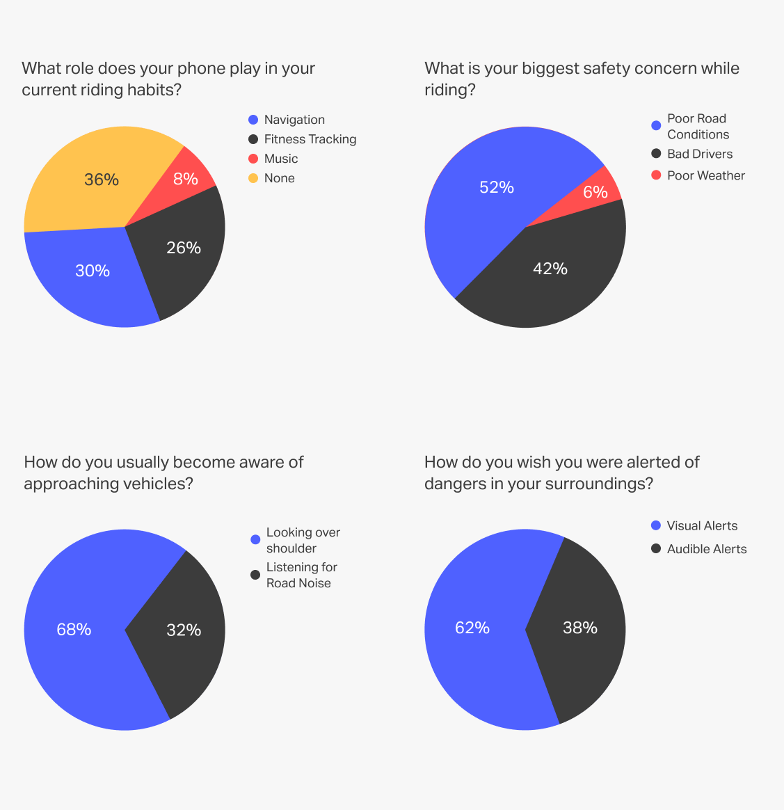
User Research
To gauge the needs of our target users, we conducted a survey of riders' habits and concerns. The participants represent a wide range of potential use cases, featuring various commute types, vehicles, intensity, and frequency (such as competitive cycling or commuting to work via scooter).
Key Results:
- 64% regularly use mobile apps to enhance their riding experience.
- 94% are most concerned about either poor road conditions or bad drivers threatening their safety.
- 68% rely on looking over their shoulder to notice approaching vehicles.
- 62% would prefer visual alerts of potential dangers to audible ones.
Competitor Analysis
To properly position ourselves within the market, I studied potential competitors and tested the products whose technical abilities most overlapped with FoveAI. This research allowed us to identify our largest threats and most valuable opportunities.
Key Findings:
- Our main competitor is the Garmin Varia, a radar based safety device.
- Providing safety alerts, a camera, and lights equalizes FoveAI with the competition.
- Other cycling oriented products focus narrowly on safety alerts, stat tracking, GPS, or video recording but there is no "all-in-one" device.
- Other safety apps only alert the user of an approaching vehicle's presence, ignoring the vehicle's type, speed, distance, location, and danger severity.

MVP Definition
Researching our target users and potential competitors highlighted a few crucial gaps in the market that could be utilized to provide a superior micromobility riding experience. This analysis enabled us to construct a blueprint of the FoveAI app focused on providing a centralized location for popular digital riding tools and leveraging our AI capabilities to deliver more informative safety alerts.
Key Features:
- Safety alerts detailing approaching vehicle type, speed, distance and location.
- Multiple display modes for various micromobility vehicles.
- GPS functionality with thorough route information.
- Live and collected ride stats.
- Access to camera feed.
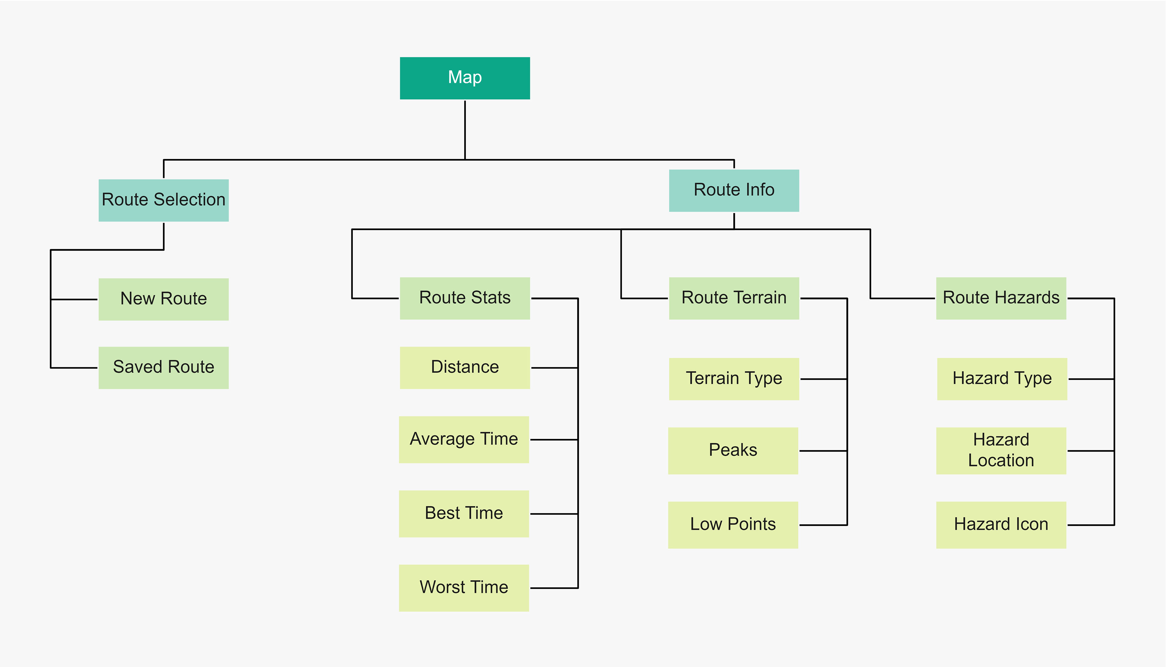
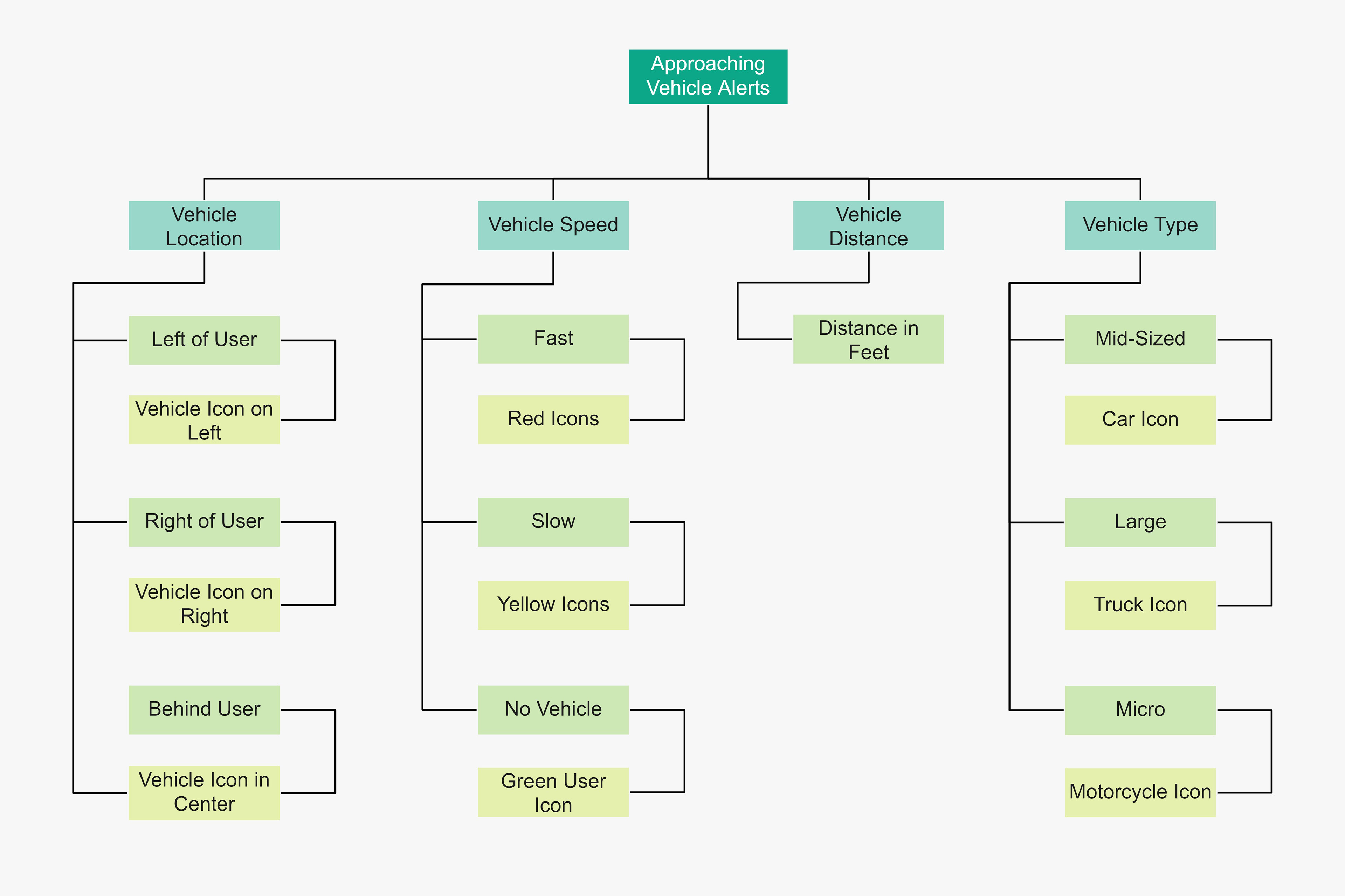
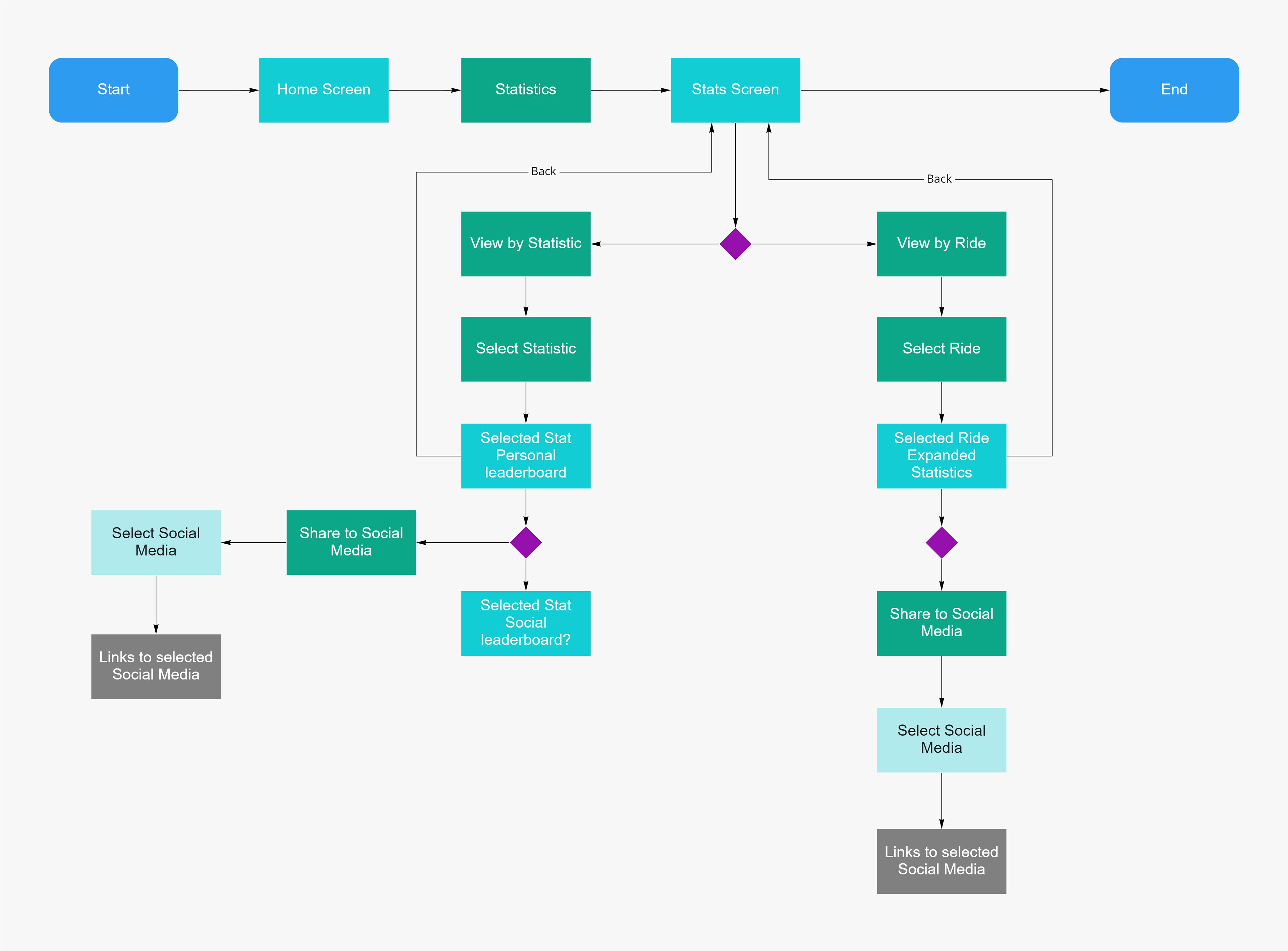
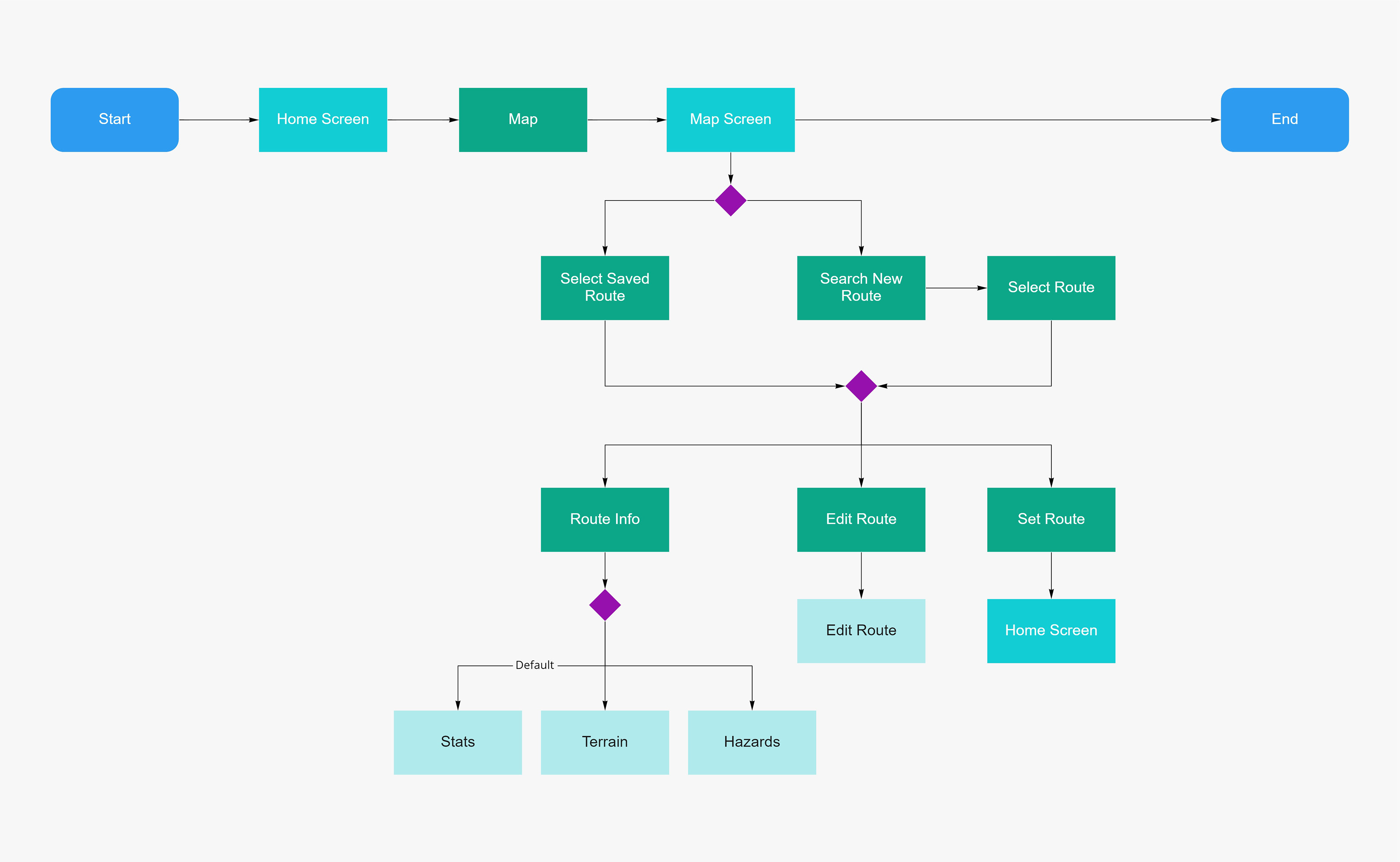
Information Architecture
I designed the architecture of the FoveAI app while considering each of our MVP needs. In order to account for each desired feature, I arranged the app into five pages, and specified the availability and organization of information within each page.

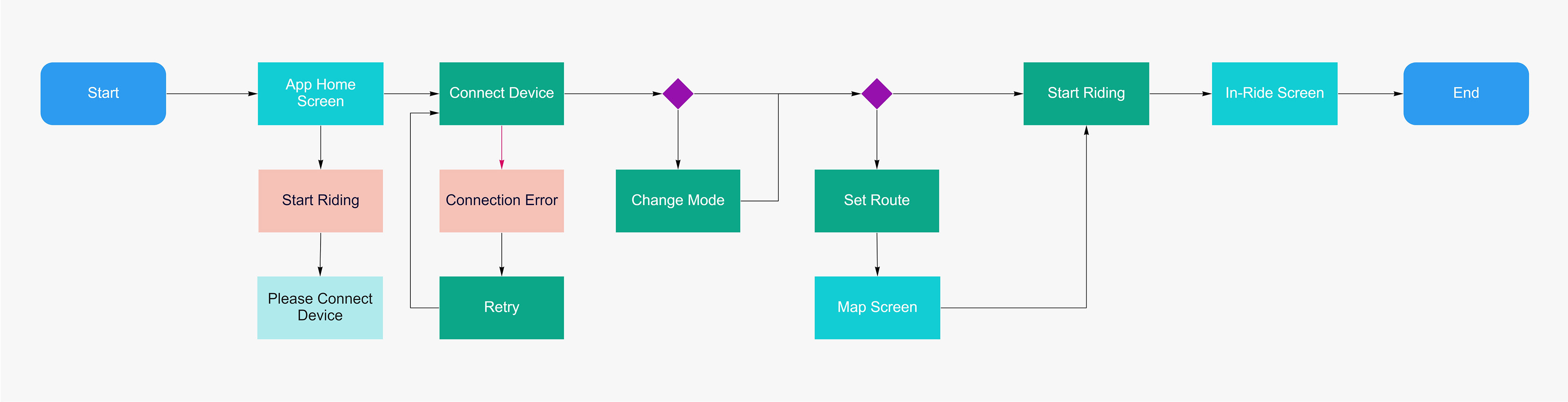
Navigation & User Flows
Having established the layout of the app, I created user flows to define each step the user takes to navigate throughout the app and to perform potential actions such as setting a route or reviewing ride stats.

Initial Prototypes
Due to time constraints, I began the design phase digitally. These initial prototypes provided a visual example to gather user feedback on and also served as a starting point for testing and iteration.
Key Design Choices:
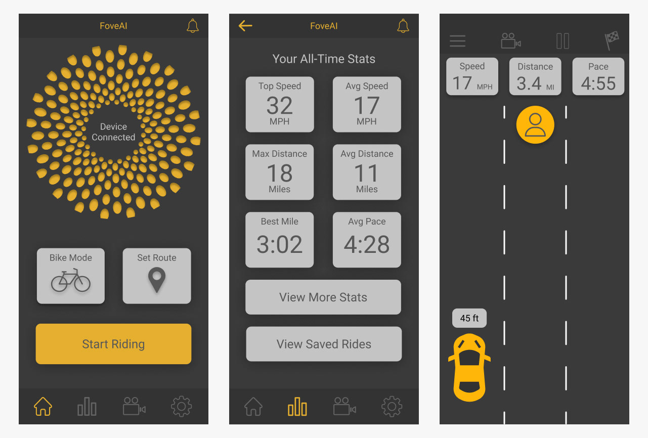
- Saddleye flower logo acts as device connection button.
- Stats page provides both personal bests and all-time averages.
- Vehicle approach speed is represented by color for quick recognition.
Testing & Feedback
Running user tests and examining the early prototypes with stakeholders sparked productive discussions within the team, which helped us to identify pain points and determine our desired visual direction.
Notable Feedback:
- Stakeholders prefer a more luxurious aesthetic.
- Users expect the map to be accessible via the bottom navigation bar.
- Users tend to skip selecting a ride mode.

Finalized Design
Having pinpointed the app's usability flaws and our new aesthetic goals, I reworked the design to provide users with a simpler, more premium feeling experience.
Key Design Choices:
- Switched to a light color scheme.
- Increased spacing between items.
- Relocated settings and map for easier discovery of both.
- Added swiping to mode selection to invite interaction.
- Altered stats page layout for easier information access.
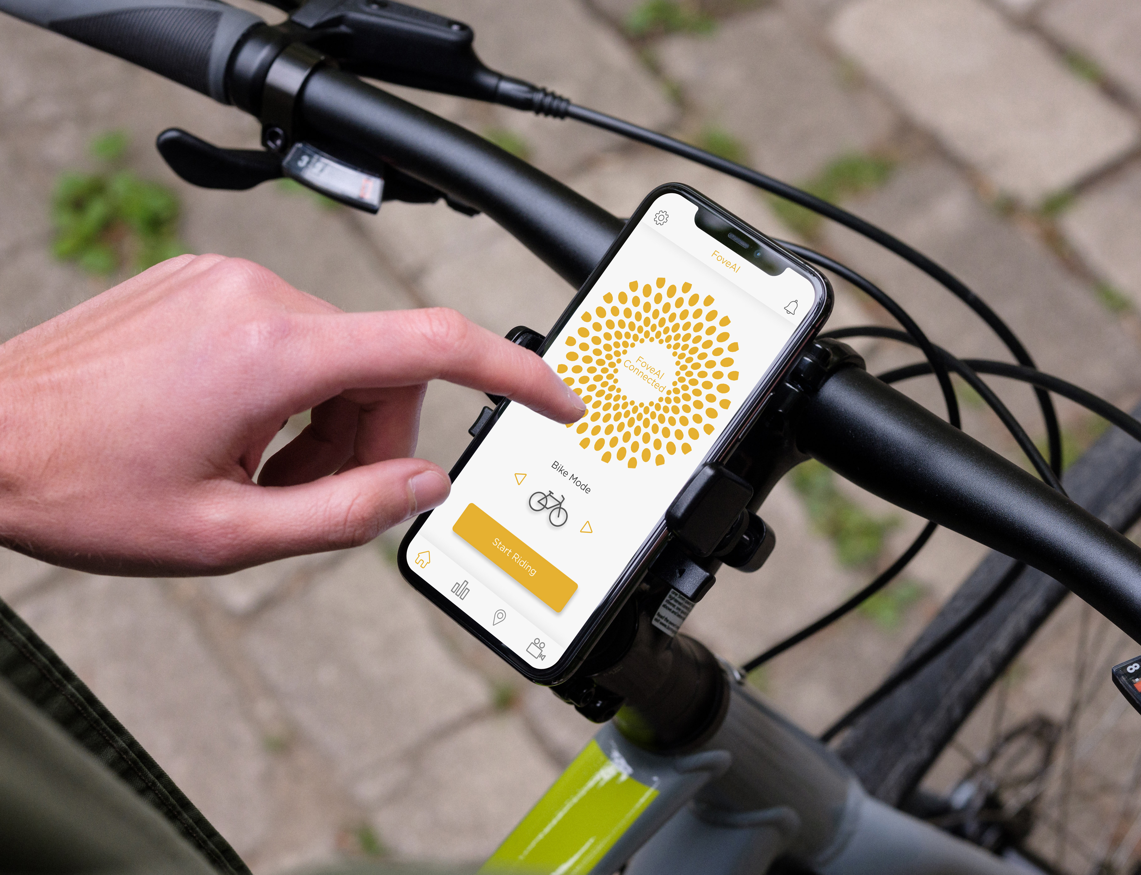
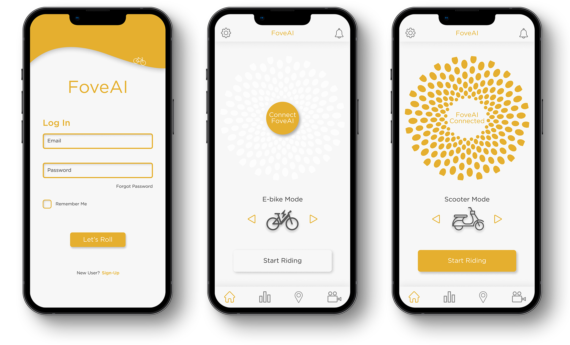
Getting Started
The opening sequence of an app sets the tone for the entire experience. The FoveAI login and home pages are designed to engage the user and get them riding as quickly as possible. Once logged in, the user simply connects their device, selects their vehicle, and begins their journey.
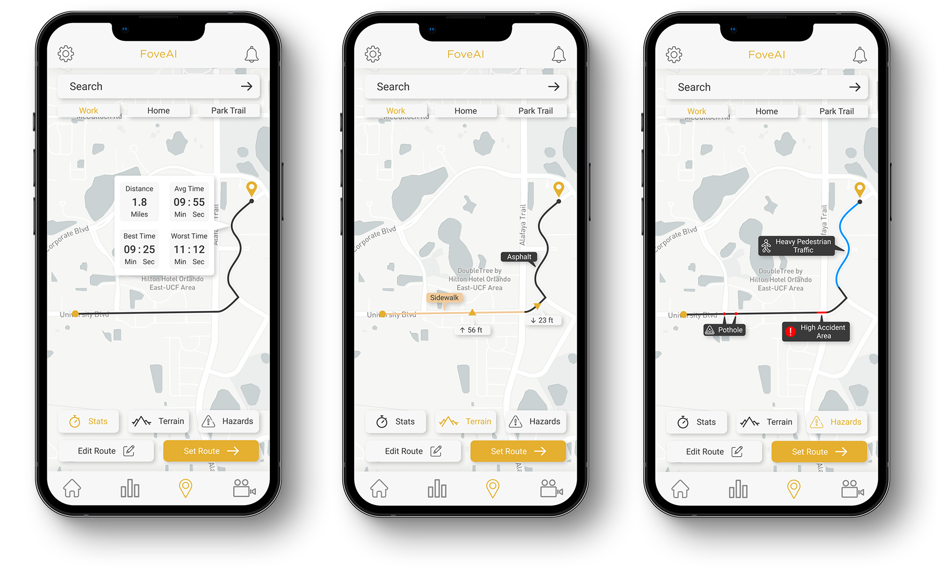
Choose Your Route
The map screen allows the user to make an informed decision about where they ride. The user can search for a new destination, or choose from their most frequently visited. Once selected, they can review the route's distance and average time, as well as its terrain and potential hazards.
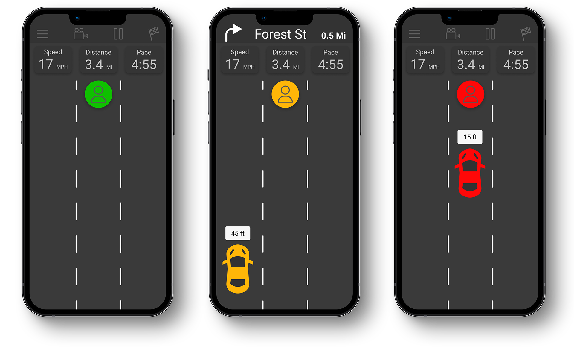
Ride With Confidence
The intent of the In-Ride Display is to present the user with detailed real-time information in a simplified form, including mode-specific data readings, navigation notifications, and safety alerts.
The safety alerts leverage the user's mental model of roads, and natural ability to make quick judgements based on perceived color, shape, and proximity.
Review Your Progress
The stats page drives return engagement by getting the user emotionally invested in the app's features. The information provided in the individual ride and all-time stats categories works to motivate self improvement and reinforce FoveAI's safety benefits.


What I Learned from this Project
Producing a potentially life-saving solution for micromobility riders within the fast paced environment of a startup was a gratifying challenge. Familiarizing myself with the user base and balancing their needs with that of the business strengthened my ability to adapt and highlighted my desire to learn.
Key Takeaways:
- Thoroughly assessing user needs is vital to building an effective product.
- Information is understood more efficiently when presented visually.
- Aesthetics play a large role in perceived usability.